
 Some Covers are Clickable!
Haha! I bet you didn't expect that! This one cover is CLICKABLE! It is the first clickable cover I made, sort of like an easter egg. There may be others, but at the time of writting this is the only one. Not all will be clickable, and the clickable ones will not be highlighted as so, so if you found this, you're either lucky, clever, have seen this cover before and might know what I'm gonna talk about, or you just saw this in the neocities page update. If it's the latter, boo.
Now, I actually have this book, but not this version of it. Let me explain.
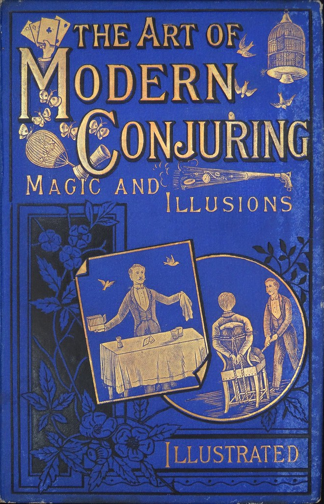
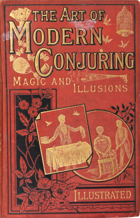
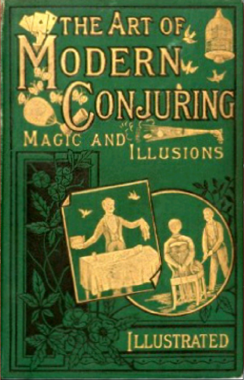
Published in 1886, there are 3 original versions of the cover of this book, all with the same design but the cover cloth could be blue, red or green. Around this time illusionism (and magick too, which sparked people's interest in illusionism to begin with) was in vogue, so the market was filled with books like this, many of which carry similar titles, such as "Modern Magic" or "The Book of Modern Conjuring", but those are written by different people (which all seem to be professors, which is strange. I dont know if they really were professors or only claimed so for the purpose of the book, that will have to be a topic for a different time). There is even a book entitled "The Art of Modern Conjuring" which is different from "The Art of Modern Conjuring Magic and Illusions".
This I didn't know until the very moment of writing this text. But sure enough,TAoMC is published in 1909 with 15 chapters and an annonymous writer (It's cover art would later be used by a book called "The Boys Book of Conjuring" which might be the same book under a different name but I cant find any info on that) . Either way, out of the mass of books on illusionism published in that era, TAoMC:Magic and Illusions seemed to stick. enough to get a re-print. But its second printing wouldn't come until June 26th 2001! A whole 115 years later! And unlike most re-prints of antique books, this one goes above and beyond.
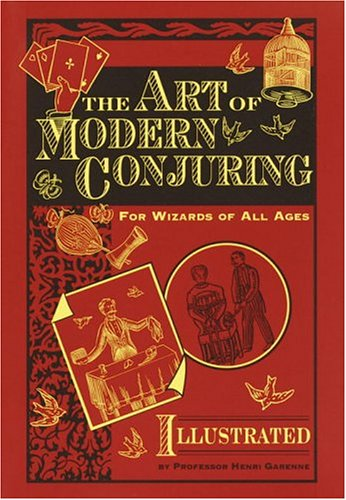
This cover is a fantastic re-make of the original one. This is the one I personally own. It's one of (it appears) two variations, the other which has the colours of the "photo" inverted, with a gold background and red detailing. This is an example which all other publishers should follow in the re-printing of antiquarian books. Try to make the covers in the style of the original one, if not identical to it. Your customers, especially those who are passionate about books, will greatly appreciate it.
But it's not the greatness of this cover re-make which spurred me to write this page, but its faults. Something has changed in the printing of books between then and now, and that change is what inspired the creation of this entire section of the website. I want to have a deeper look into the changes, and into designing alternatives for traditional cover printing methods to replicate the feel and style of the 1800s covers without losing things which this re-make so sadly does.
So what is it? What changed? Here's why I think this doesnt feel the same as the original. Upon laying eyes on it, you notice a few things that differ. The black background behind the title, the addition of "For Wizards of All Ages" and "By Professor Henri Garenne" do not impact it much. These wouldn't be atypical for book covers designed in the 1800s. However, the change in the title's appearance is much more grating. This lettering design is much more modern than the 1800s which is easily apparent. Something similar happens in Barnes and Noble's printing of Dante's Divine Comedy. The publisher there chooses to go for an art-deco style typeface, which while may be contemorary (this style of cover did indeed last until around the 1930s, well into the art-deco era) that type of lettering was hardly, if ever, used on book covers, being moreso relegated to use in posters and the such.

Another thing is the removal of the flower detailing, and its replacement with a simplistic alternative. While simple flower designs may be common, they tend to be used in thin bands, similar to that at the top of the modern cover. Well expressed, detailed flower illustrations are a popular design choice for covers of the golden cover age, even on books whose topic has nothing to do with nature, so the ommital of this detail is a strange choice, when the original cover had such a great example of it.
Yet again, another thing the original has, which the modern cover ommits is areas which are covered in flat gold leaf (the tablecloth, the man's shirt and face, the persons in the circle illustration, the base plate of the birdcage, the cards and the hand holding them), replacing them with the colour of the bookcloth. This is a strange choice, which they overcorrected in the second printing of the modern cover (see second paragraph).
But this leads into the final and the greatest of issues with the re-make: The materials are entirely different, and so is the way the book is manufactured. The original cover uses actual gold leaf, where as the modern printing uses golden coloured ink, which is apparent in the difference in colour between the two. The cloth used is entirely different; 1800s book cloth has a rubberised feel or coat to it, which the modern one replaces with the typical imitation(?) book cloth that is oh-so-common in modern clothbound books. The black ink used in printing is also different, the new one seems to rub off much more easily. Copies of the book from the 1800s printing have hardly had the paint rub off, where as the copy I have from 2001 is already beginning to lose its contrast.
Lastly, the original book, and books of its age, seem to have been printed using a different method, perhaps by hand using a manual press. This left deeper impressions in the cover, and gave it more of an embossed look. The factory printed modern cover has some depressions digging into it, but they are slight, not all that visible unless you take time to study it in detail.
Do not get me wrong, I love this cover, both in its classic and modern form. For a large commercial publisher, who does not specify into fine books, this is a cover that goes beyond expectations. But these details awoke me to the fact that we lost something when we moved from cover art to dustcovers, something which I hope to rediscover in the pages of this website. This re-print has caused all of this to happen, and I couldnt be happier. As for the contents of the book itself? It has a lot of tricks you could easily pull of at the bar, and it uses the original illustrations. The publishers have given it fringed pages to make it feel more antique, used and tattered, than it really is. It's a great little book, and for the £4 I spent on it, having lead me down this rabbit hole, a great investment.
As always, if you want to contribute to the collection, do feel free to email me at capstasher@gmail.com or private message me on Discord at @capstasher.