

There are some things about this website I am not very pleased with. In fact, I would go so far as to say I am DIS-pleased with some of the things on this website. There are also things that I have not yet added, either due to lack of skill, lack of time, or lack of motivation. This corner of the net site is dedicated to listing and exploring the possibilities for the future of the website.
The Library
The current state of the section in which articles are displayed is in a deplorable state. However, I have a plan to fix it.
Here is how the articles used to look like

Ill. #01 - Screenshot of the original method of displaying articles
And this would be fine, if I had a small number of articles of a consistent size. Just imagine scrolling through chronologically ordered points and points of text, the list the length of a progressive socialist meme, to find that one article you're looking for. However, I have picked up on three types of original writing which I plan to add, as well as other miscelaneous content. They are as follows:
- Thoughts, Rants and Rambles - Short form writing, typically in the form of an idea or comment of a thing in my life. (Also included could be photos or single page scans)
- Articles - Longer form essays, on a single topic. Overall a medium length piece of writing.
- Research Hubs - Complex, wiki-like structures which cover every aspect of a piece of media, software or anything else. These are the largest pieces of writing
- Scans of Books - Self explanatory. Scans I have personally made of public domain (
or not) or publically available scans which I used content from - Miscelaneous - Collections, audio files, animations, etc.
So what is the solution. How do you order this content in a distinct, easily accessible, and visually satisfying way. I believe the best way to do that is to do it the way its been done in the early (not the earliest, but early still) days of the internet, through skeuomorphism(?) skeuomorphism
noun
/ˌskjuːəʊˈmɔːrfɪzəm/
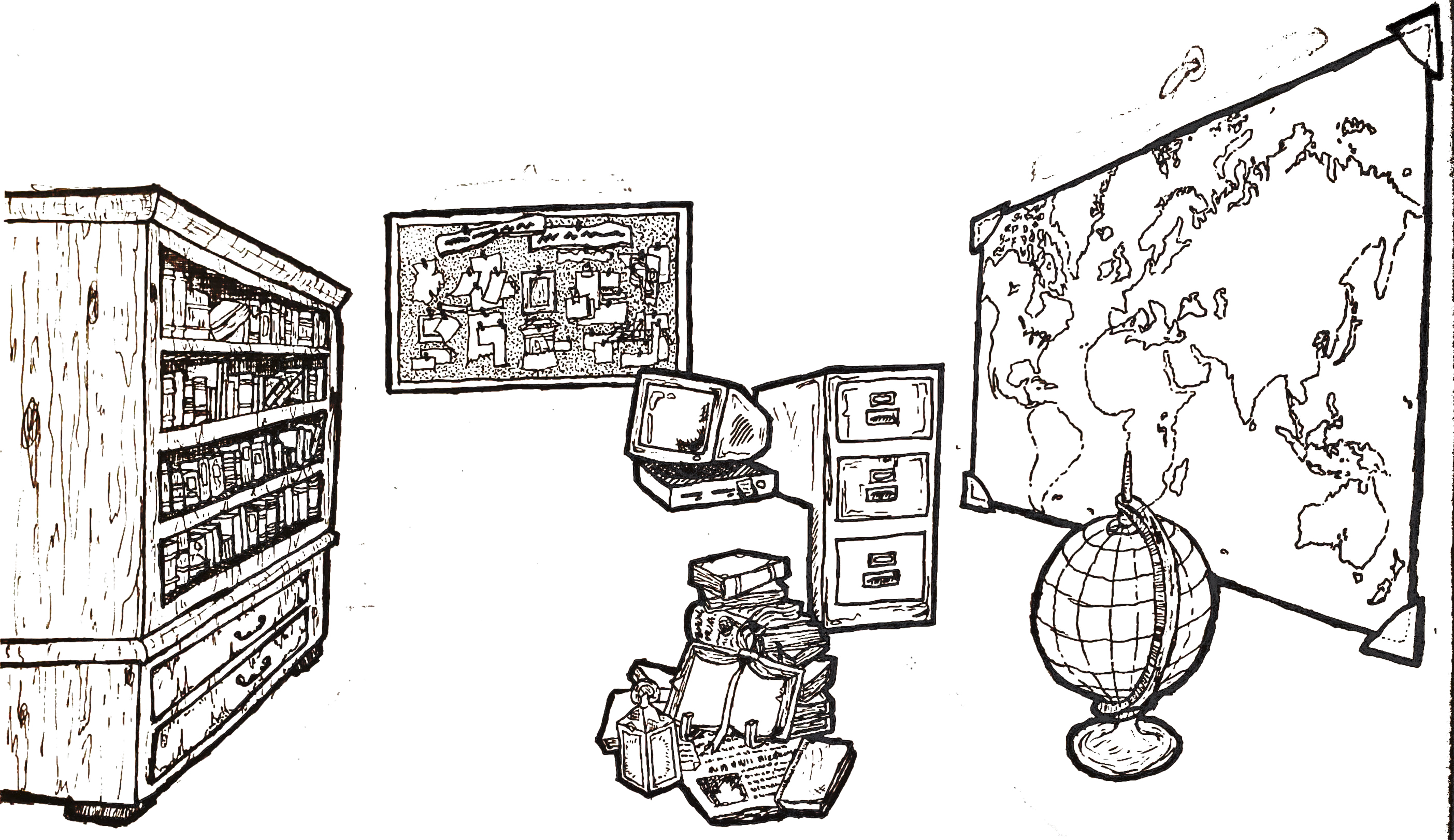
: the use of an ornament or design representing a real life utensil or implement to symbolise something in a digital space. It makes things feel more natural, closer to that which we already know. I present to you, The Library...

Ill. #02 - Prototype depiction of "The Library"
The Library is a simple concept. Everything has its place. Each thickly outlined element represents one sort of thing which will be available in The Library. When clicked upon, they will take you to a new screen where their contents are displayed in an easy to look through manner. They are as follows:
- The Bookshelf - This will house the Research Hubs in the form of books. Each book will have its own unique colour as well as the name of the hub on the spine and cover. When a book's spine is hovered on, it will reveal the book's cover. Clicking on the spine will take you to the Research Hub. An example of one of these books currently resides in the current version of the Articles page
- The Book Stack - This will contain actual scans of real books, magazines or documents, that I have either scanned personally, have used in my projects, or have an interest in. Similarly to the bookshelf, items will be displayed (mostly) as books, with the covers being a drawn version of the actual cover.
- The Filing Cabinet - This will be home to the Articles. They will be illustrated in the form of folders, newspapers or magazines, each with a unique design.
- The
ConspiracyNotice Board - This will be home to the Thoughts, Rants, and Rambles, as well as single photos and single page scans. They will be displayed directly, on post-it notes, crumpled pieces of paper, polaroids, torn pages and others. They will not need to be clicked on to view, and the whole notice board will be a large area vertically and horizontally. - The Computer - This will house various miscelaneous things that do not fit anywhere else. These may include audio files, photo sets, artwork, animations and some things which will be expanded on later in this article.
- The Map and Globe - Unlike the other ones, this is home for one of my other projects. It is called a World of Weirdness, and it's a map containing as many locations that would be interesting to visit but are off the beaten track. This project promises to be more encompassing than Atlas Obscura, including many things they wouldnt include, like urban exploration spots and places with funny names
Currently, this is the lineup for the website's Library. Other projects may come, the rest of the room is meerly sketched in by pencil (not that the current sketch will be the one on the website). There are other projects I am thinking of adding to the library, such as a herbarium, which may be displayed by a small terrarium, potted plant, or framed dried plant. This would include either professional, public domain illustrations, ripped from scans of old books, or hand made illustrations at quarter of the quality, as well as information not included in typical herbariums such as magickal properties, rituals the plant is used in and more. This is, as of yet, not a project I am set to accomplish anytime soon. I have enough on my plate. Instead, let's talk about a project I am set to release soon.
The Largest Pure 88x31 Button Collection on the Internet
I am hoarder by genes, and archivist by trade. When I noticed people having collections of these little buttons, I knew I had to start my own. It is my belief that this format is of historical importance when it comes to the internet and I would like to document its existance, variations and history. Yet one thing sorely missing from large 88x31 collection was an adherence to the standard. I am very anti-postmodern on this issue (as I am on many, but this in particular I am very anti-postmodernist on), an 88x31 button collection need to strictly focus on buttons that are eighty-eight pixels wide by thirty one pixels tall, otherwise the collection has no value. This means that even small deviations, of one or two pixels width or height, crosses you out of the category. At the time of writing, this is the current size of the collection, number and byte wise:

Ill. #03 - Screenshot of the number of files and total filesize of the collection
This is not yet free of duplicates, nor will it be by the time the collection will be out. The piece of softare which I found to do this job cannot see two images as the same if one has been compressed, even if the differences are unintended and invisible to the human eye. It can also not see the difference between two identical images with different file formats. This therefore is a process to be done by hand. I keep adding to it and I keep scanning through it, but I only have so much time and focus to spend on this. This is where I would appreciate the help of fellow neonauts on this process of archiving the buttons. I need help in scanning for duplicates, hunting down buttons and even perhaps writing short history pieces on each buttons (for example the creator of the button can write about which itteration of the button the specific one is, and the creative proecess behind it, or, if its a historical button, like those made for the Netscape v. Internet Explorer battle of the 90s, a little background about the thoughts which lead to making the button). Try to keep clear of bias and sloganeering when writing the descriptions, obviously. I cannot offer much for help on this project, short of inclusion in the "Thank You" list, perhaps a little ranking minigame, where it is publically available how many contributions (time, not monetary) each user makes. However I believe it is in the interest of the internet, and specifically, the Neocities community, that this project be successful. There will also be a credits page for the people whose collections I pulled from in building mine and to the original button creators. For both aiding with the collection and having your name included in the credits list, you will need to e-mail me. My e-mail is available in my contacts page.
The 88x31 is the main collection, however there are others that I plan to start, which I hope will grow as large as the aforementioned one:
- Near 88x31 Buttons - Buttons which slightly miss the margin, defined as being +- 10x5 pixels away from the standard
- 80x15 Badges - Less common now, used to be very common throughout the 2000s and into the early 2010s
- Alternative Size Badges - Close to 80x15 but not quite
- 99x56 Stamps - Very common, originating from DeviantArt
- Alternative Stamps - Stamps in sizes different to 99x56
- 100x50 Name TBA - Not sure what this size is named but I have gathered a handful in my travels through Neocities
- 150x20 Blinkies - Very common, especially on Neocities, DeviantArt and some corners of Tumblr
- 150x45 Name TBA - Not sure what these are either, but the ones I've gathered focus around SEGA games
- 300x100 Imageboard Banners - I believe they began use of 4chan and spread to western imageboards from there, might be mistaken
- 468x60 Banners - Used for ads as well as chan board banners, still pretty common
- And as many more as I can find or are requested of me. I remember seeing other formats when I was scouring through Bin Laden's hard drive (the place is a gold mine of 2000s internet content)
These collections will be freely available for anyone to take and add upon, so they can have a larger collection than mine. Just be warned, I will steal it back, with everything else you added onto it, and add more than you. And I hope you do the same to afer that. This way, the collections, the archives, can grow larger and larger.
All these collections will be residing on the Computer in The Library. Ideally, the Computer would have a whole simulated desktop environment, but I'll have to work up to that. First off I'll begin by only (relatively) slightly moving out of my comfort zone and attemtping to do immovable windows with iframes to make up the browser. each collection will be a button on the desktop that will flip to a new page in the iframe.
I try to tell a story with the design of The Library. This is when it hit me...
Choose Your Own Adventure Journey
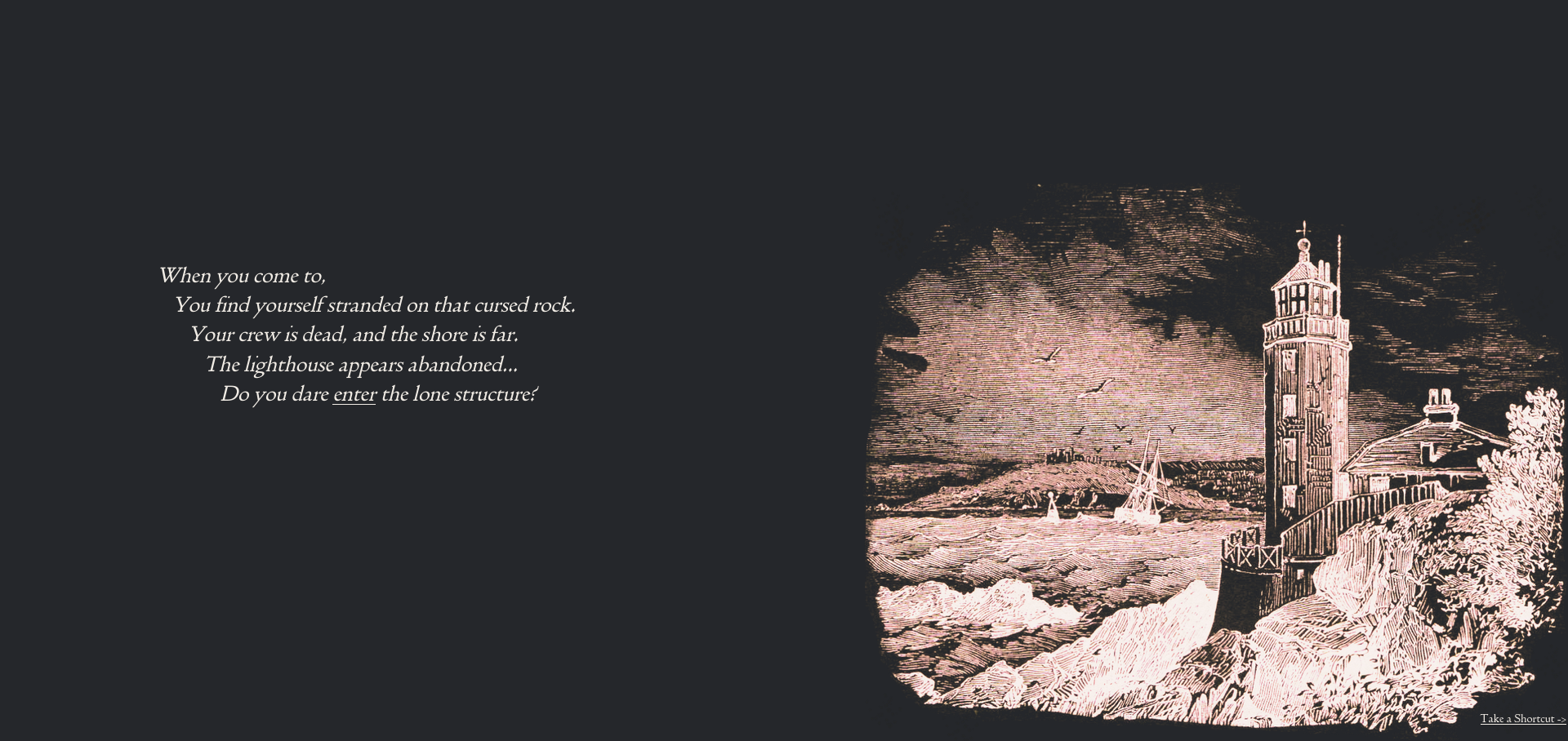
It would be really nice to actually tell a little short story with the website. A little text, choose your own adventure, with the odd illustration here and there. The story would follow a sailor caught in a storm while on the search for a legendary lost library of knowledge. The storm would crash his boat and kill his crew on a stoney island with an abandoned lighthouse. Inside the lighthouse, you would find, The Library. Of course, there would be a shortcut button, you wouldnt want to do that story every time you wanted to read an article, it would put people off. However, its a nice thing to try an make for people who would be interested in this sort of thing. The adventure would also have a specially designed soundscape for every scene, to really put you in the shoes ears of the sailor.

Ill. #04 - Screenshot of one of the current screens of the adventure
All these things on the website, I hope will improve my skills. Be them writing, web development, sound design, web hunting, the main thing I get out of all this is an improvement in my skills, and a place to show off what I've learned. And I hope, dear reader, that you will enjoy the things to come on this website.
